

idea 2-

These are the basic plans for my magazine layout, on my front cover I will have an image of my model, Lucy Bolden, on the front cover wearing a glamorous dress using the 'super smiler' facial expression.
I will be using natural lighting on my image to get a realistic perception of her skin tone etc, however in some cases I will use artificial lighting in the form of a flash to brighten colours and tones on the image. This will mainly be used for images that will be used on the website and feature pages.
For my text, I want to use a bold font that will stand out from the other cover stories and I want to use an tahoma based font that is round, I will be conducting more research into which fonts i feel suit the representations I am looking to achieve which are femininity and individuality.
Stereo typically, magazines use a plain white background for the magazine however I intend on breaking this stereotype and using a brown (beige) colour or a light grey because they will enhance my image while tying into my into my intended theme of autum fashion. They also suit all of my planned colour schemes making them stand out more and catch the readers attention.
In regards to camera shots and angles I want my main cover image to be a long shot at eye level so that her hair, makeup and outfit can all be seen and therefore create a autumn tone through my styling. I will use one close up of a model for a feature on makeup but for all other images, which will mainly be of makeup and clothes, I will use mainly medium close ups so that all the quality of the products are maintained without any of the products being cropped out. I want them to be realistic images of what the products really look like.
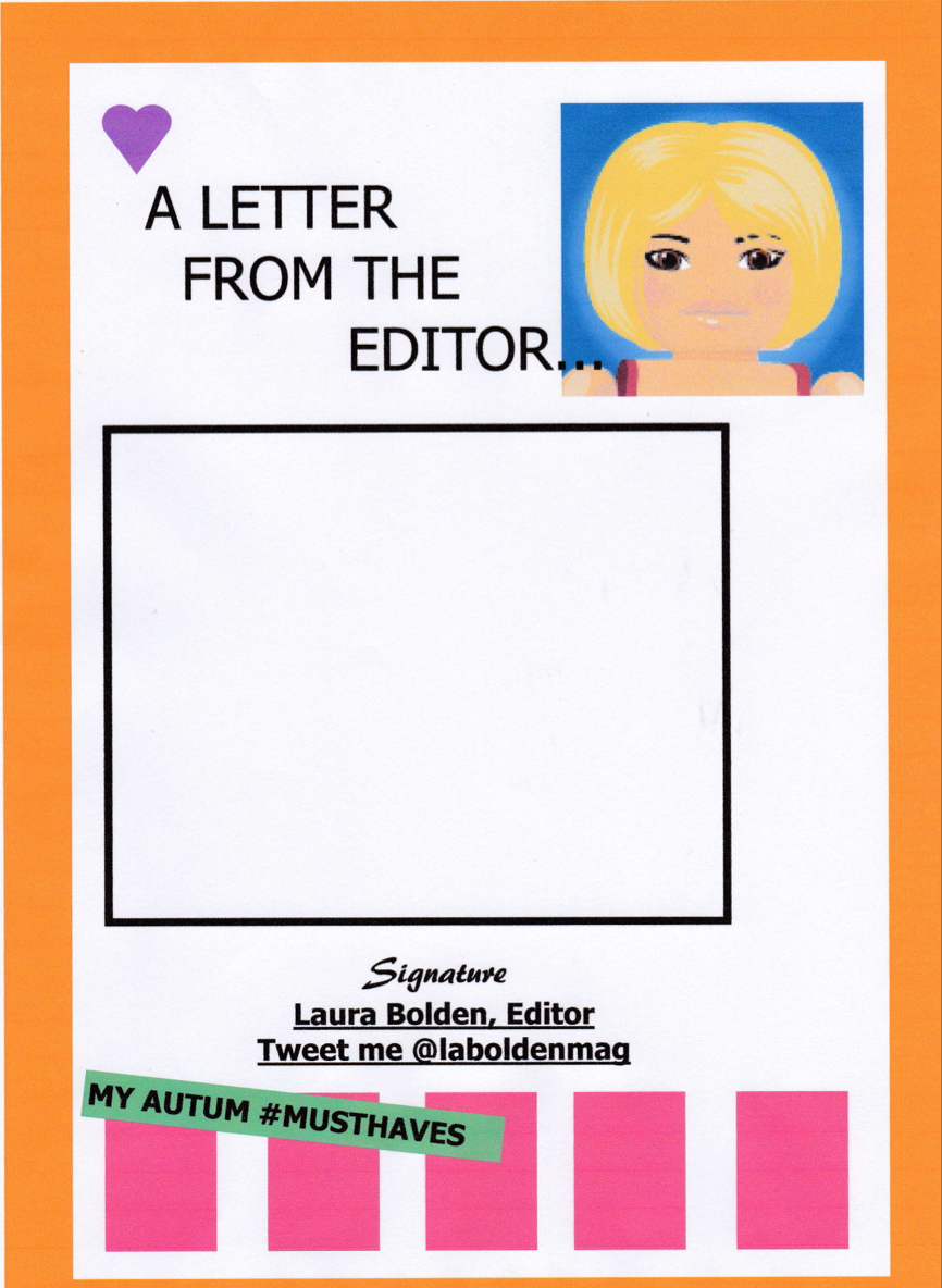
My front cover layout will be very conventional with a strong masthead front and center, a model over lapping, bar code in the bottom left corner and sub headings in the left and right thirds. My editors page layout will have multiple images in a row along the bottom center of the page, an image of myself in the top right corner, masthead in the top left and text taking up the central page. There are two plans for my feature pages, one is a double page spread which will include many long shot images of my models in the corners with smaller, medium shots of clothing and products positioned around the pages along with text boxes on the insides of the pages. The second is a plan for a single page which will have a central masthead with scattered images around it with page number and web address in the top right corner.
No comments:
Post a Comment